Skip to content
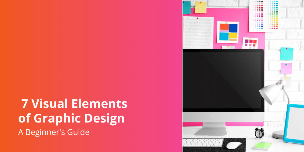
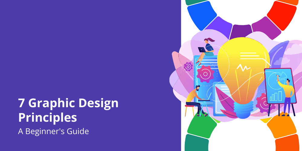
Graphic design is a blend of art and science that combines visuals to communicate ideas and messages effectively. Whether you’re a professional designer or just starting out, learning the basic elements of graphic design is super important. These seven elements are like the building blocks for making awesome and impactful designs.
1. Line
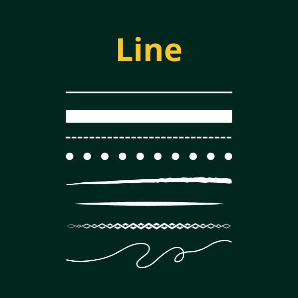
Lines are the most basic element in graphic design. They can be thick or thin, straight or curved, and are used to create shapes, divide space, and guide the viewers eye.
How Lines Work
Lines can show movement, energy, and feelings. For example, horizontal lines can make you feel calm and steady, while diagonal lines can make things look like they’re moving.
2. Shape
Shapes are made by combining lines or using solid areas of color or texture. They can be geometric (like circles, squares, triangles) or organic (like free-flowing, natural forms).
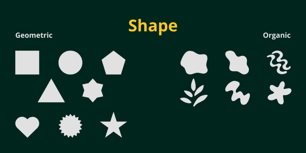
Why Shapes Matter
Shapes are important for making things look interesting, sharing meanings, and organizing info. Designers use shapes to make logos, icons, and other cool stuff.
3. Color
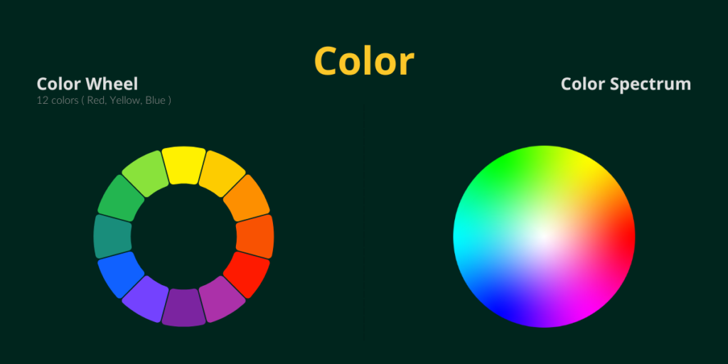
Why Color is Important
Color is a super powerful element in graphic design. It can make you feel emotions, set moods, and change how you see things. Picking the right colors is key for showing brand identity, making things stand out, and guiding where people look.
Primary Colors
Primary colors are Red, Yellow, and Blue.
It makes up the basis for the color wheel.
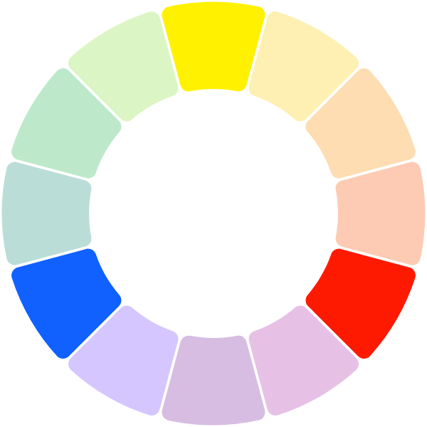
Secondary Colors
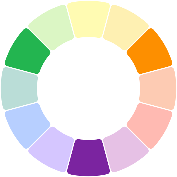
Secondary colors are made
by mixing equal portions of the
primary colors. These create
Green, Orange, and Purple.
Tertiary Colors
Tertiary colors are made by
mixing a primary color with a
neighbouring secondary color
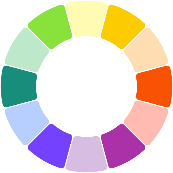
Tertiary Colors
Warm Colors
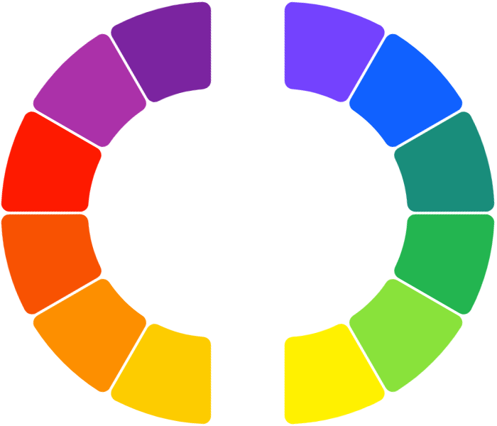
Cool Colors
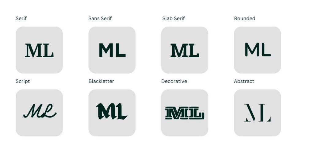
4. Typography
Typography is all about arranging type (words) to make them easy to read and look good. It involves picking fonts, adjusting sizes and styles, and spacing things outright.
Anatomy of Typography
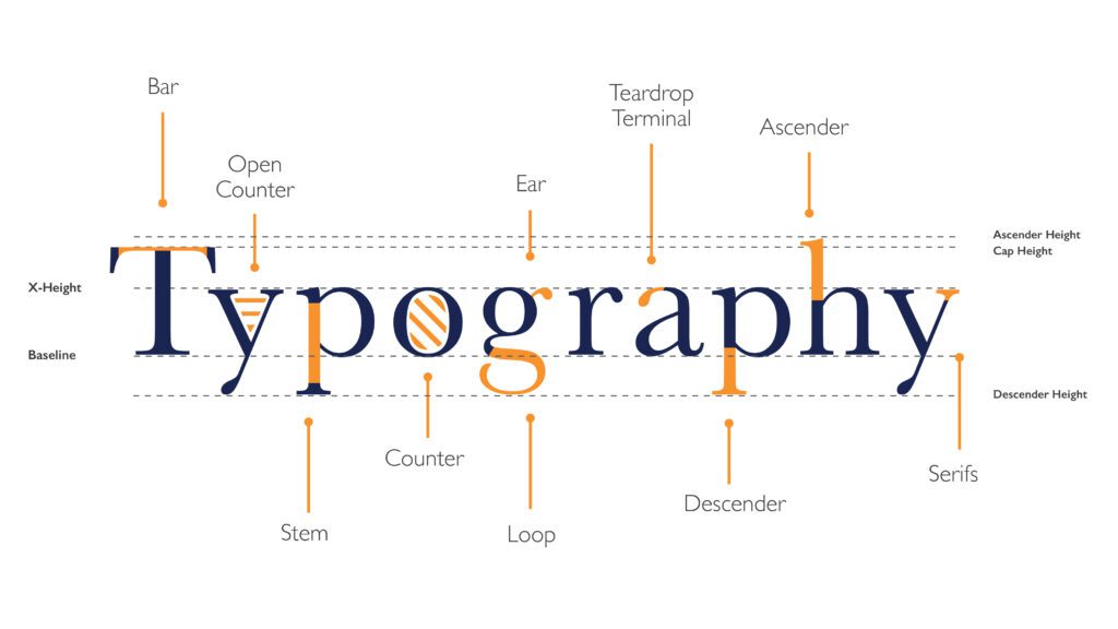
- Bar: The horizontal stroke in characters like A, H, e, etc.
- Open Counter: The enclosed negative space within a letter like a, e, s.
- Ear: The small stroke that projects from the top of the lowercase g.
- Teardrop Terminal: The small stroke at the end of some letters like c.
- Ascender: The part of a lowercase letter that extends above the x-height, like b, d, k, l.
- Stem: The main vertical stroke in characters like b, d, l, etc.
- Counter: The negative space or “hole” within a letter like o, a, e.
- Loop: The enclosed curved stroke within letters like g, p, R.
- Descender: The part of a letter that extends below the baseline, like g, j, p, q.
- Serif: The small line/projection at the end of a stroke in certain typefaces.
- X-height: The height of the main body of lowercase letters like x.
- Cap Height: The height of capital/uppercase letters.
- Ascender Height: The height of ascending strokes above x-height.
- Descender Height: The depth of descending strokes below the baseline.
- Baseline: The invisible horizontal line on which most letters sit.
Why Typography is Cool
Typography helps show tone, and personality and keeps a consistent look across different designs.
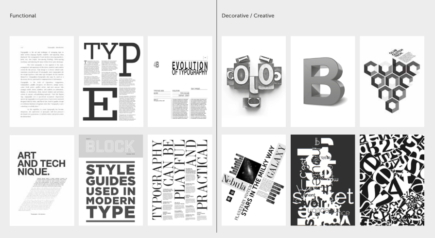
Font Types Example
Functional & Decorative/Creative Typography Sample
5. Texture
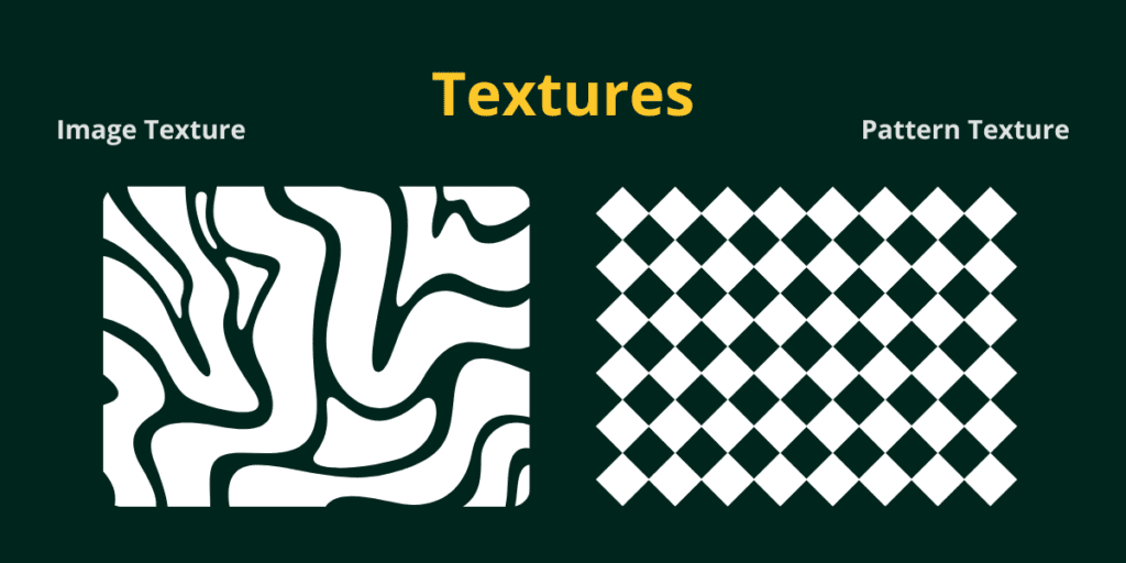
Texture adds depth and a cool feel to designs. It can be physical (like raised surfaces) or made with patterns and digital effects.
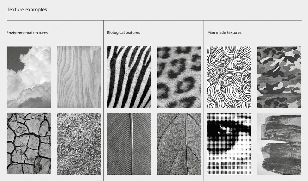
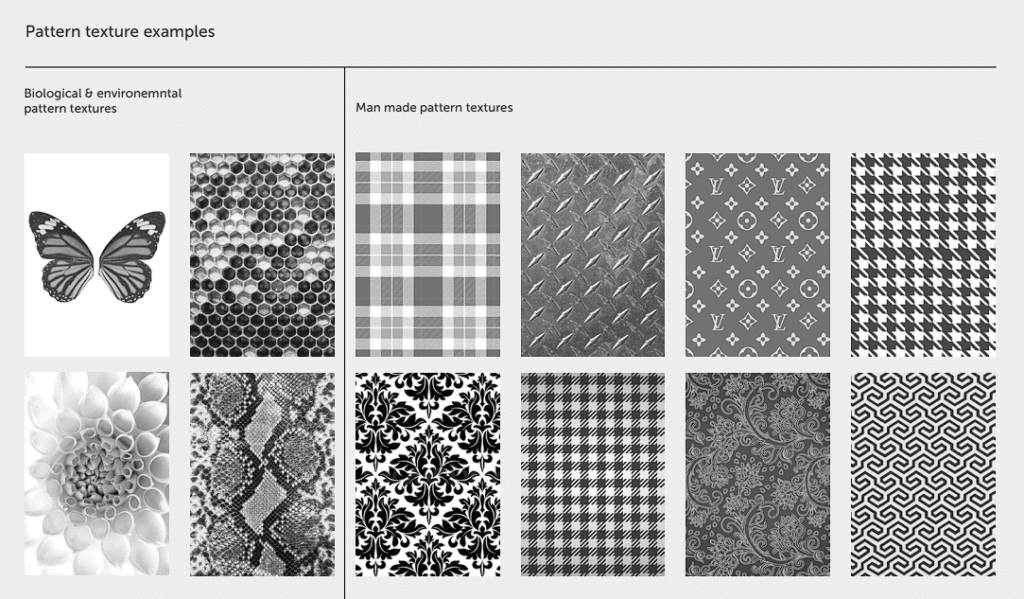
Why Texture is Awesome
Textures can make things look real, bring out emotions, or just make designs more interesting.
6. Space
Space, also called negative or white space, is the area around and between design elements.
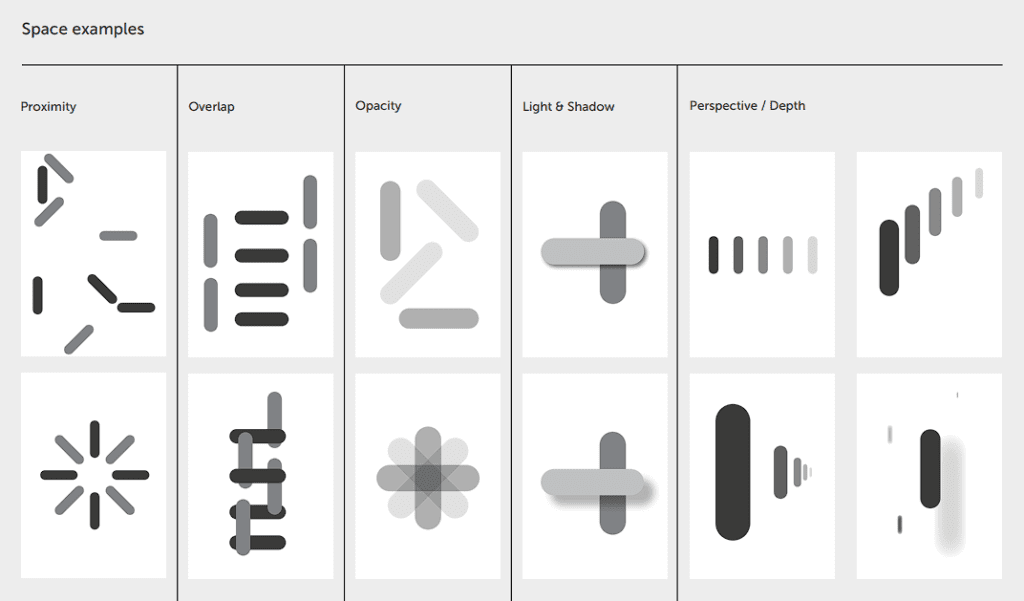
Why Space Matters
Using space right makes designs look balanced, highlights important stuff, and makes things easier to read. Designers need to think about how to use both positive and negative space to make designs look awesome.
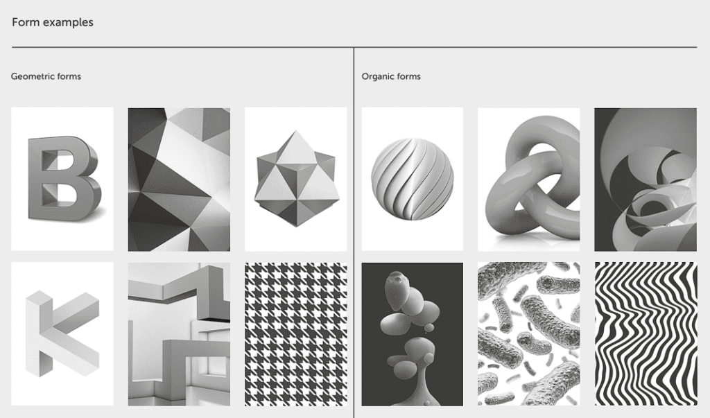
7. Form
Form refers to the three-dimensional aspect of design elements. It adds depth, volume, and a sense of physicality to designs. Forms are measured by its height, width, and depth.
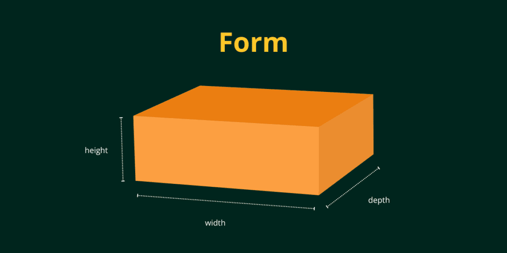
Forms can be geometric (cubes, spheres, cylinders) or organic (natural, irregular shapes). Designers use forms to create realistic representations, and abstract compositions, or to suggest depth and dimension in two-dimensional designs.
Conclusion
By learning these seven elements and understanding how to combine them effectively, designers can create visually compelling and impactful designs that effectively communicate their intended messages. Whether you’re making a logo, a website, or a marketing campaign, these elements serve as the foundation for creating memorable and engaging visual experiences.