Skip to content
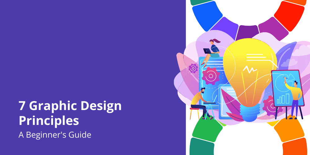
As a starter, knowing the graphic design principles that make your designs stand out is essential. In this article, we will explore the 7 graphic design principles you should know to create visually appealing and effective designs. From balance and contrast to color theory and typography, these principles will guide you in making informed design decisions.
The Importance of Graphic Design in Marketing
Graphic design plays a crucial role in marketing. It helps businesses communicate their messages effectively, attract attention, and create a memorable brand identity. Today’s visually-driven world constantly bombards consumers with visual content, making it essential for businesses to make their visuals stand out.
When done right, graphic design can evoke emotions, convey information, and influence consumer behavior. It helps businesses create a strong visual identity that reflects their values and resonates with their target audience. From logos and websites to social media graphics and advertisements, graphic design is everywhere.
1. Balance
Balance is about achieving visual stability by distributing elements evenly throughout your design.
Three Main Types of Balance
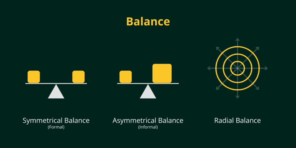
1. Symmetrical Balance
We encounter symmetrical balance everywhere in our daily lives, from the design of our kitchen appliances to the layout of our school textbooks. When things are symmetrical, it just feels right and makes us feel at ease.
To achieve symmetrical balance, designers must evenly balance everything in the design, keeping the central point in mind. This typically requires lining up elements vertically and horizontally so they appear the same on all sides.
Symmetrical designs work best when everything looks the same in size, shape, and weight. People tend to like symmetrical designs because they are pleasing to the eye, whether it’s in art or in nature. It’s no wonder we naturally want to create balanced and harmonious artwork.
2. Asymmetrical Balance
Don’t worry if the word “asymmetrical” makes you feel a little uneasy or off-balance. It’s totally normal to feel that way!
When it comes to asymmetrical balance in art, things might seem a bit wonky at first. But there’s a trick to making it all work together. Asymmetrical balance is all about finding harmony with different shapes and sizes, while still keeping the overall balance of the artwork in mind.
Even if you’re dealing with shapes that don’t match up perfectly, you can still create a balanced composition. Just pay attention to the visual weight of each shape and use other elements around them to bring everything together in a beautiful way.
3. Radial Balance
Radial balance is like the boss of a picture or design. It’s all about making sure everything revolves around a central point. Imagine a spider web with the spider in the middle – that’s radial balance! It’s when all the objects in a piece of art are arranged in a circular or radiating pattern, with the focal point right in the center. This helps create a sense of harmony and balance in the design. So, next time you’re drawing or taking a photo, think about using radial symmetry to make your work really pop!
To create balance in your designs, consider the size, color, and placement of elements. Use white space strategically to give your design room to breathe. Remember that balance doesn’t necessarily mean everything needs to be perfectly symmetrical; it’s about creating a sense of harmony and equilibrium.
2. Contrast
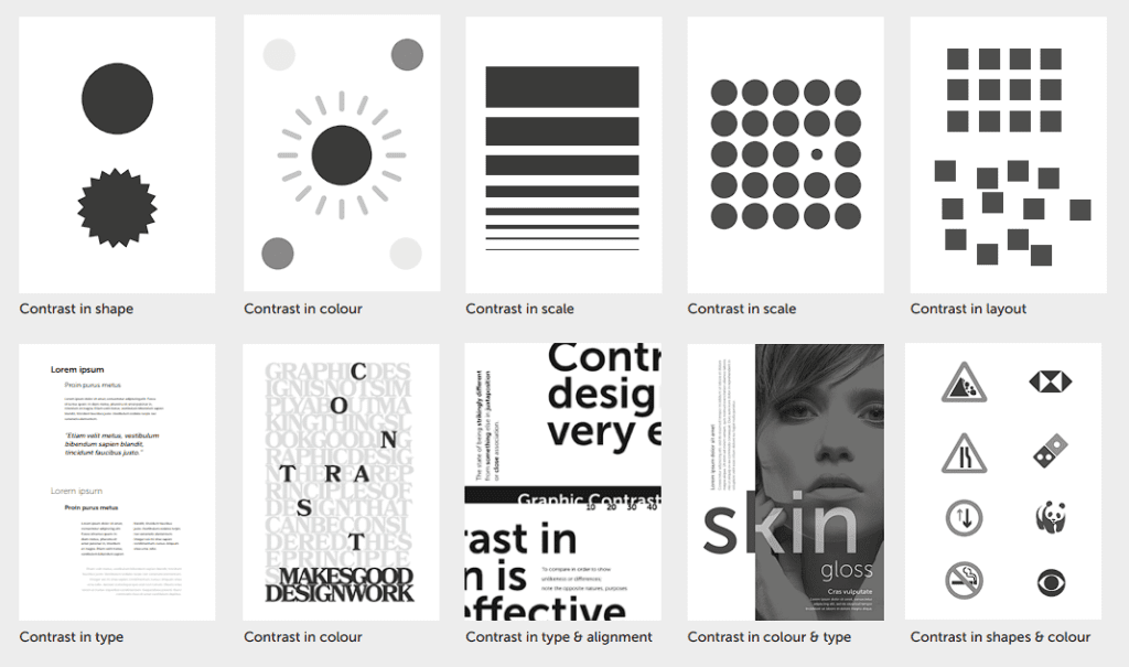
Contrast is all about creating visual interest and making certain elements stand out. By combining elements with opposing characteristics, you can create a focal point and hierarchy in your design. Contrast can be achieved through color, size, shape, texture, and typography.
For example, you can use contrasting colors to make certain elements pop. Pairing a bold color with a neutral one can create a striking effect. Similarly, using varying font sizes and weights can create contrast and emphasize important information. Experiment with different elements to find the right balance of contrast in your designs.
3. Emphasis
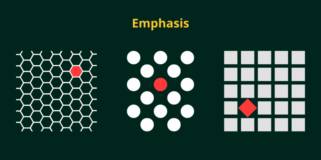
When you want to make something stand out in a design, you can use different tricks like making it bigger, bolder, or a different color. This is called emphasis. It’s kind of like when you want to draw attention to something without making it look too different from everything else. Contrast, on the other hand, is when you want to show the difference between two things. But sometimes, you can use contrast to help emphasize something, like putting a dark shape on a light background. This makes the dark shape really pop out.
Adding emphasis to something in a design is like putting a spotlight on it. It’s the first thing you notice, but it shouldn’t take over everything else. Think of it like walking down a long hallway and seeing a bright wall at the end. Your eyes are naturally drawn to that wall because it’s the focal point. It’s like the star of the show, but it still needs to work with everything else around it to look balanced.
4. Unity
Unity refers to the harmonious relationship between all the elements in your design. It ensures that everything works together cohesively and creates a sense of completeness. Unity can be achieved through consistent use of colors, fonts, and imagery.
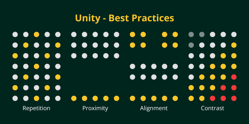
To achieve unity, designers use harmonious colors, shapes, and textures, balance positive and negative space, and utilize repetition, proximity, and alignment. In short, all the graphic design principles come together to create a beautiful picture.
Conceptual Unity
Conceptual unity means that all the different parts of a design work together and share a similar idea or theme. It’s like when you write a story – all the characters, setting, and events should feel connected and make sense together.
Visual Unity
Visual unity is about how the actual visual elements like colors, shapes, textures, and images all look harmonious and unified. It’s making sure nothing looks out of place or clashes. The design elements should feel like they all belong together in one cohesive visual composition.
If you made a poster about your favorite sport, conceptual unity would mean the text, images, and graphics all clearly represent that sport’s theme. Visual unity would mean using colors, fonts, and styles that all look good and fit nicely together on the poster. Both types of unity make the overall design feel complete and well-thought-out.
5. Hierarchy
Hierarchy is about organizing elements in a way that establishes their importance and guides the viewer’s eye. It helps create a visual flow and ensures that the most important information stands out. Designers can achieve hierarchy through various techniques, such as using different sizes, placements, colors, and typography styles.
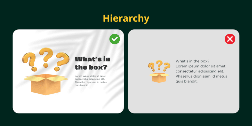
By using a combination of size and placement, you can establish a clear hierarchy in your design. Designers naturally draw more attention to larger elements, while they perceive elements placed higher on the page as more important. Designers can also use bold or contrasting colors for important elements to create a hierarchy. Finally, typography plays a crucial role in hierarchy by using different font sizes and weights to emphasize certain information.
6. Proportion
Proportion is about the relationship between different elements in your design. Designers must ensure that elements are visually balanced and don’t overpower each other. Designers can achieve proper proportion through careful consideration of size, scale, and spacing elements.
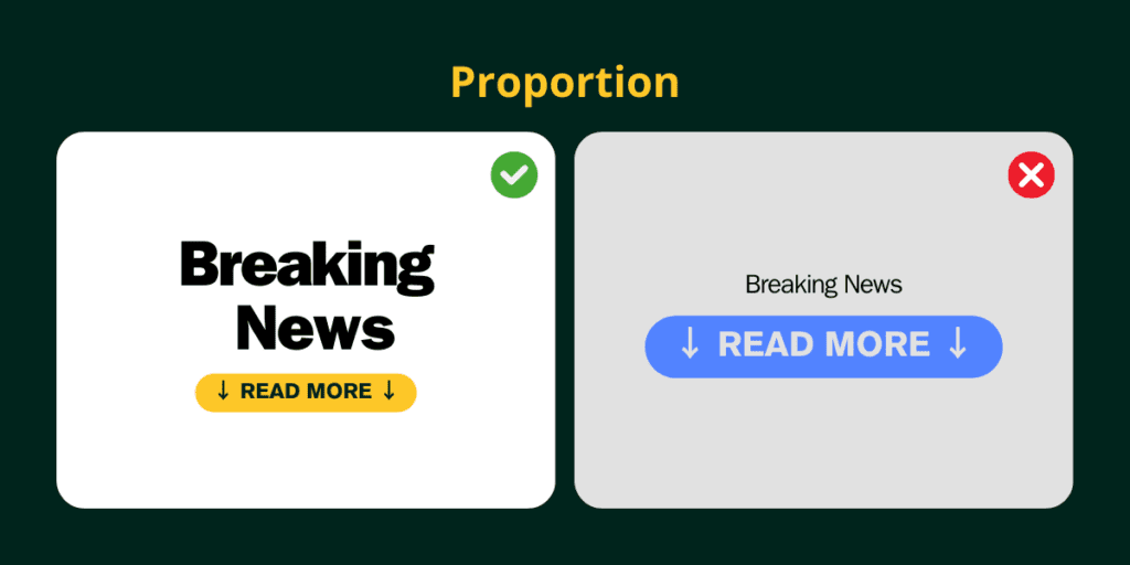
To create proportion in your designs, consider the size and scale of each element. Ensure that elements are neither too large nor too small in relation to each other. Pay attention to the spacing between elements to create a visually pleasing composition. By maintaining proportion, you can create a harmonious and visually appealing design.
7. Rhythm
Rhythm in graphic design is about creating a pattern or sense of movement. It’s like music – there’s a beat or repeating rhythm that makes the song flow smoothly.
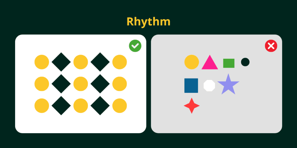
In a design, rhythm is achieved by repeating certain visual elements like colors, shapes, lines, or images. This repetition creates a pattern that leads the viewer’s eye through the design in a consistent rhythm.
Rhythm can also be created through variations – making elements bigger, smaller, bolder, etc. in a repeating sequence. It’s like the bass drum hitting louder every few beats in a musical rhythm.
Having good visual rhythm prevents designs from looking too static or chaotic. The consistency and flow created by rhythm make designs feel harmonious and easier on the eyes.
Applying 7 Graphic Design Principles to your Projects
Now that you understand the 7 graphic design principles, it’s time to apply them to your projects. Start by analyzing existing designs and identifying how these principles are used. Experiment with different techniques and elements to find what works best for your design.
Remember that these principles are not strict rules but rather guidelines to help you create effective designs. Don’t be afraid to think outside the box and push the boundaries of traditional design. The key is to find a balance between creativity and functionality.
7 Essential Visual Elements of Graphic Design
Conclusion
In conclusion, understanding and applying the 7 graphic design principles can significantly impact the quality of your work. These principles provide a framework for creating visually appealing and effective designs that resonate with your target audience.
From achieving balance and contrast to creating emphasis, unity, hierarchy, and proportion, each principle plays a crucial role in guiding your design decisions. By mastering these principles, you can elevate your graphic design skills and create stunning visuals that captivate your audience.
Therefore, unlock the potential of these 7 graphic design principles and take your designs to the next level! Embrace creativity, experiment with different techniques, and never stop learning. With practice and a solid understanding of these principles, you’ll be well on your way to becoming a successful graphic designer.